(About Project)
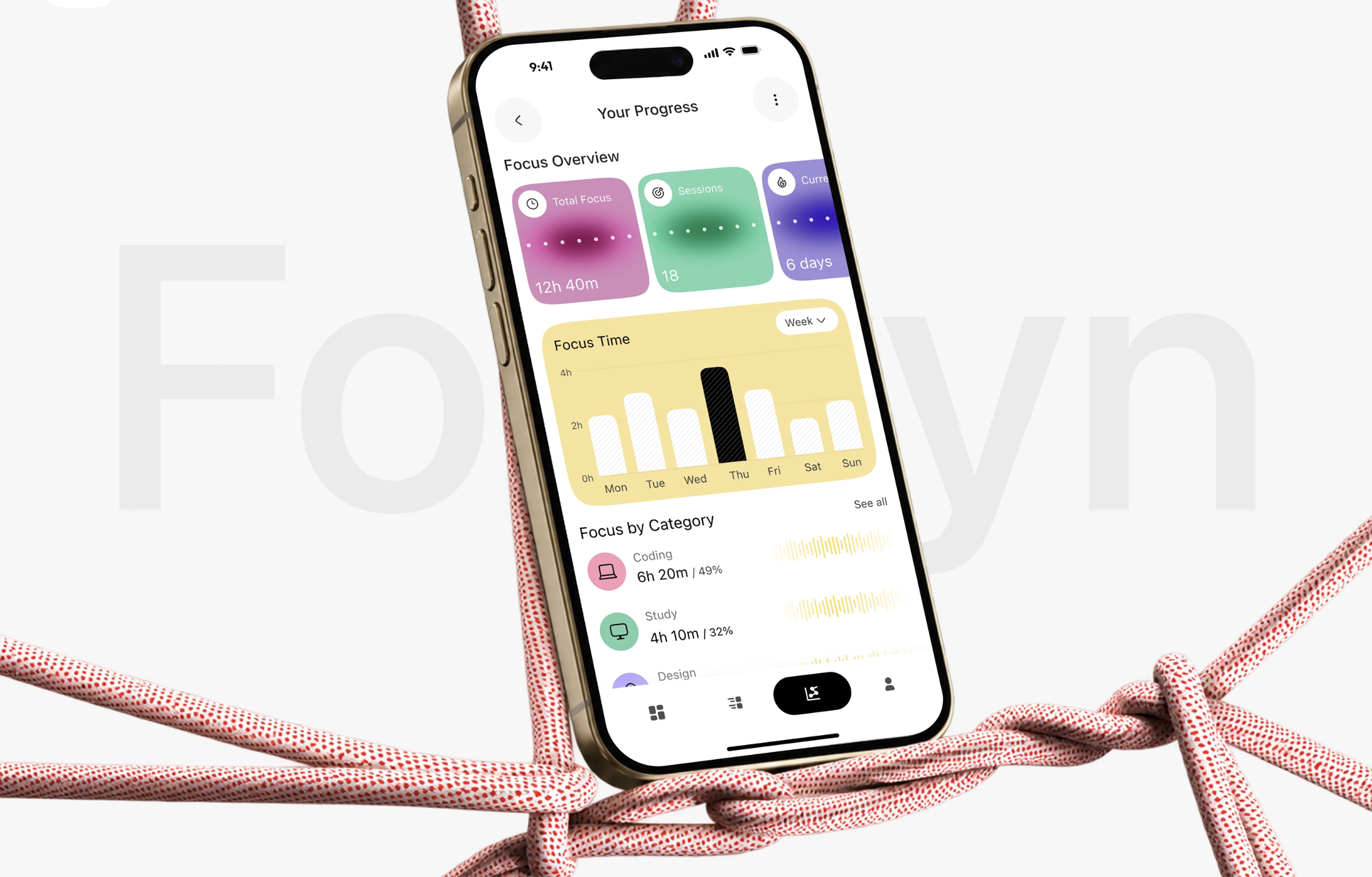
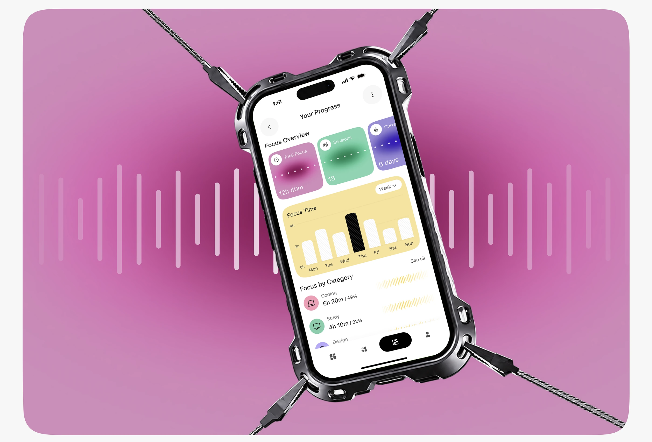
This focus app needed to make data feel friendly. Charts and stats can be dry, so the brief was an interface that people would enjoy checking and want to improve.
(Solution)
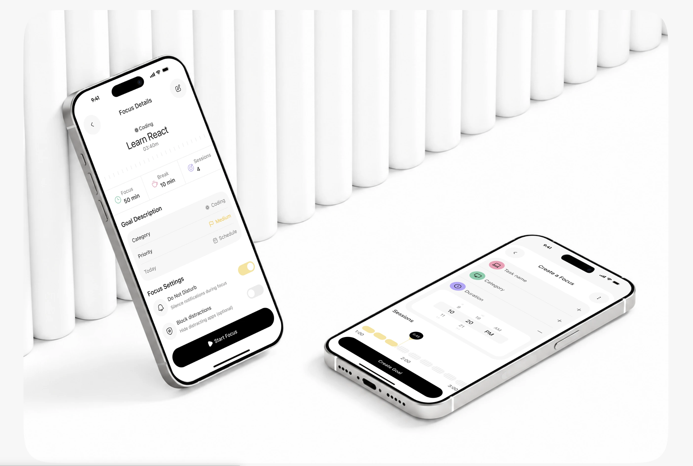
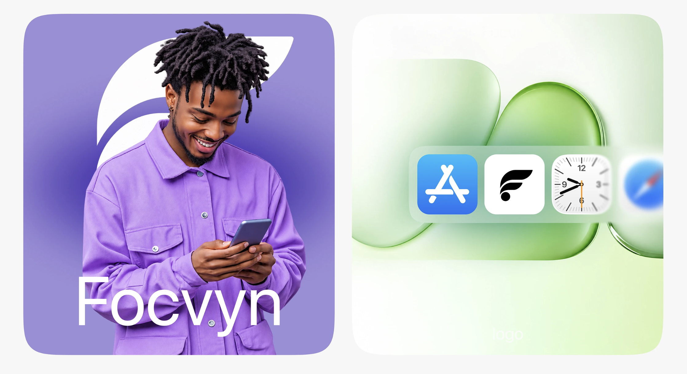
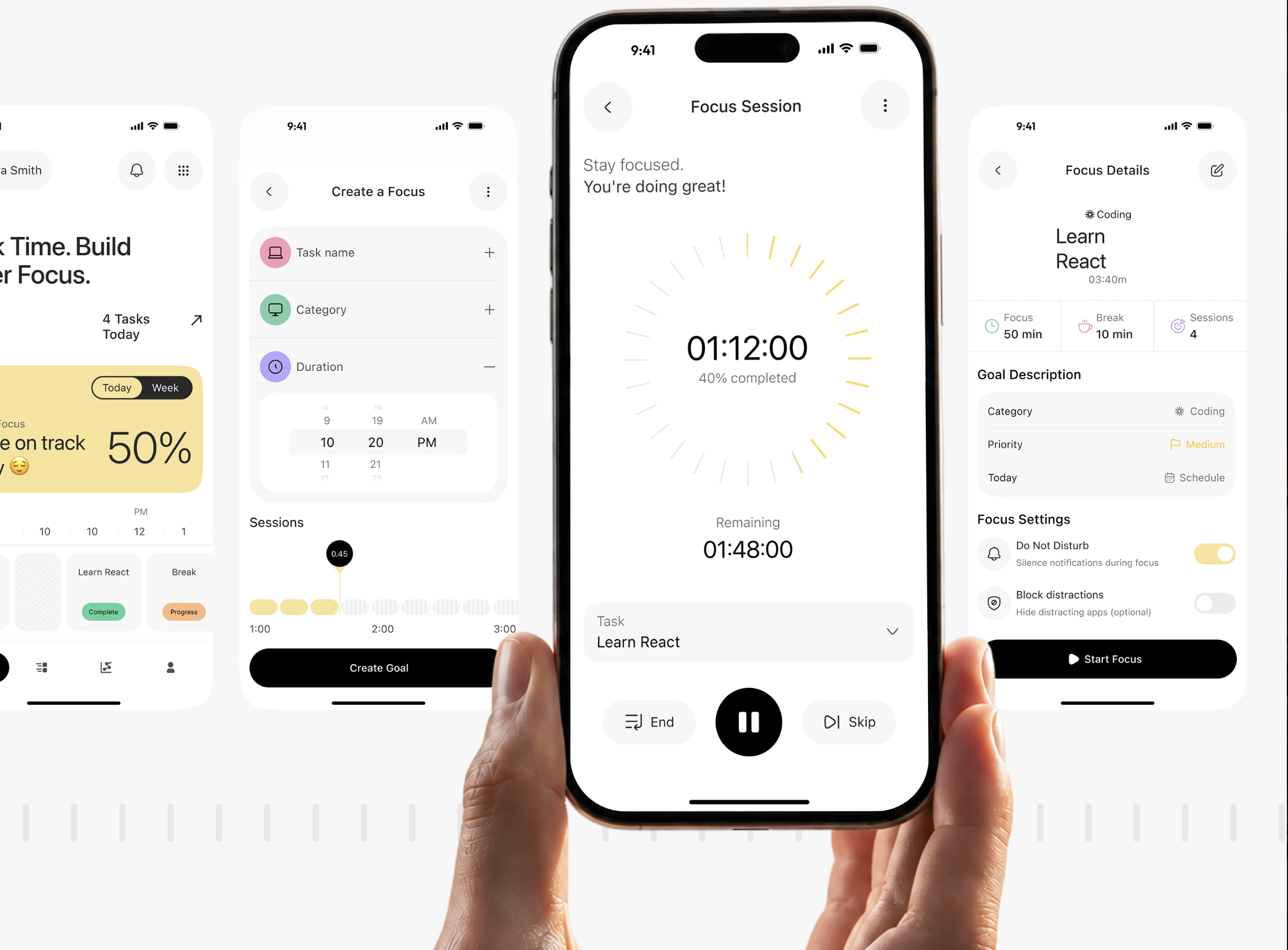
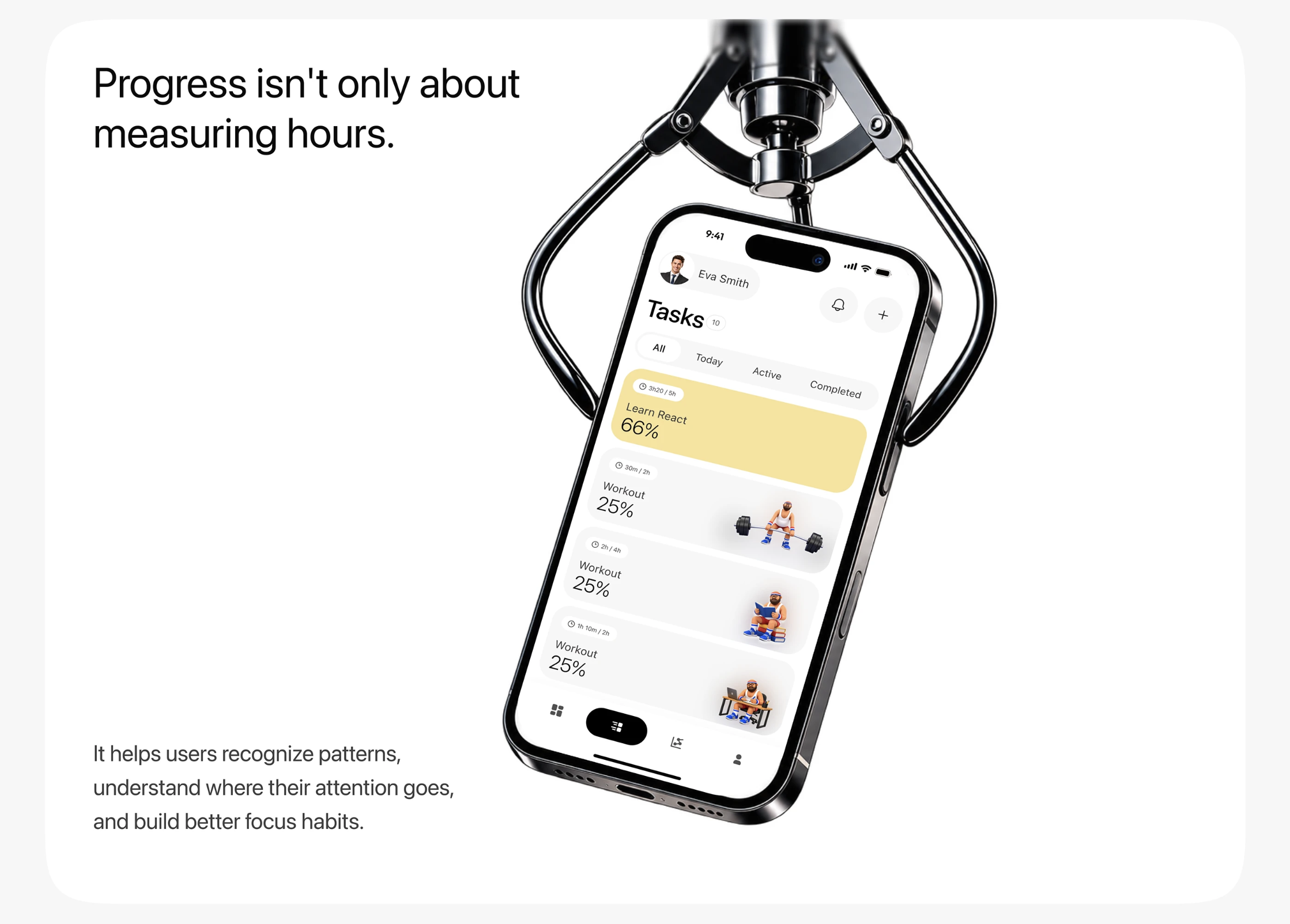
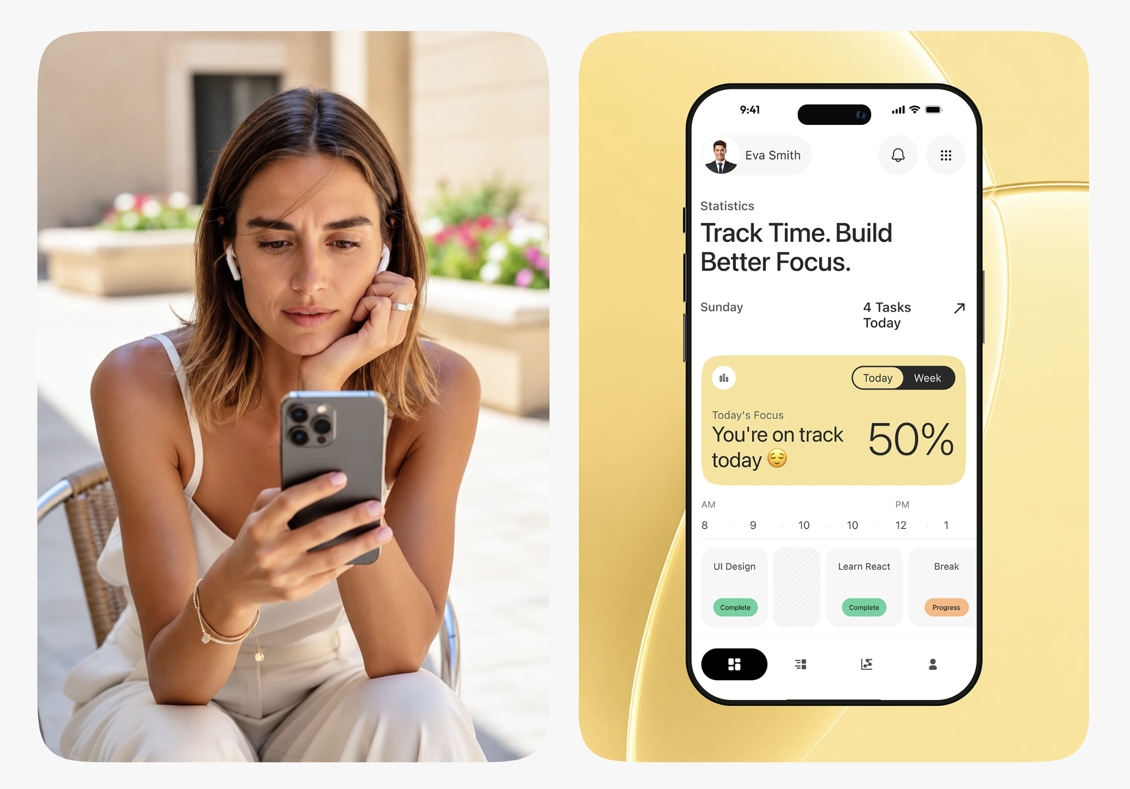
We gave each stat its own colour and soft gradient, built the weekly view around a bold highlighted bar, and kept the layout open so numbers read instantly. The campaign visuals carry the same energy into marketing.
(Result)
The design makes focus time easy to understand and pleasant to review.
It gives the product a recognisable look that carries across the app and its marketing.

Turn. Vision.
Into. Reality.